

A Persona-Led Website For The People Who Sell In The Field
-
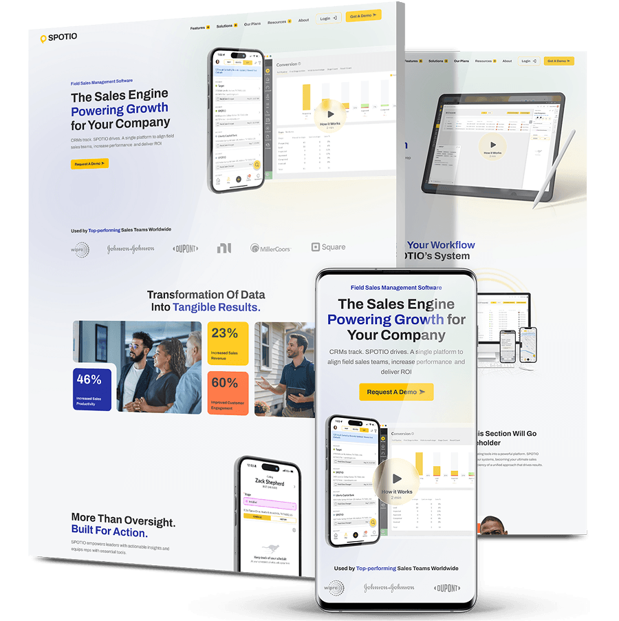
SPOTIO’s website was its main lead generation tool, but it had no clear journeys for the field reps, sales managers and sales leaders it serves, and it didn’t present SPOTIO as the premium, enterprise-level platform it is, especially next to competitors.
-
Because SPOTIO wasn’t starting from zero, Digital Silk treated the rebuild as brand, UX, conversion and SEO work together. We built a brand strategy and refreshed visual direction, then created a journey for each buyer persona.
-
The new site presents one cohesive, enterprise-level brand, with tighter navigation and CTA placement. Its high-performing pages were migrated carefully so years of SEO equity carried across to the new build.


The Challenge
No Clear Journey For Any Audience
Field reps, sales managers and sales leaders came to the site with different questions and different pain points, but there was no clear path for any of them. Each visitor had to work out alone where the relevant information was.
A Premium Product That Didn’t Look Premium
SPOTIO is an enterprise-level platform, but the site didn’t come across that way. Next to competitors, it undersold the product, a real problem when the people deciding are VPs of Sales and CROs.
Inconsistency That Hurt Conversion
Style, messaging and imagery changed from page to page. That inconsistency weakened trust as visitors moved through the site and cost conversions from the traffic it already had.
SEO Equity Too Valuable To Lose
Over the years SPOTIO had built strong search equity. A rebuild that ignored it could have wiped out the rankings that brought traffic to the site in the first place.

The Solution
-
A Brand Strategy And Refreshed Visual Direction
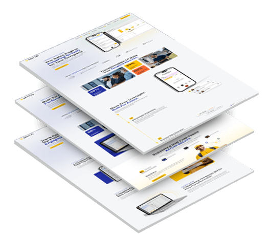
We started with brand strategy, then refreshed the visual direction across color, gradients, typography, iconography and imagery. The result is a single system that holds together on every page and reads as enterprise-level. -
A Journey For Each Buyer Persona
We designed a dedicated journey for each primary audience. Each one speaks directly to that audience and addresses its specific pain points, so a rep, a manager and a sales leader each find the case made for them. That persona-led web design approach shaped everything that followed, from the site architecture to where each call to action sits along the way. -
New Architecture And Navigation
We rebuilt the site architecture and tightened the navigation so visitors reach what’s relevant to their role quickly, without working through content meant for someone else. -
Conversion-Focused UX And CTA Placement
We placed calls to action deliberately along each journey and aligned the messaging around them, turning a set of inconsistent pages into one cohesive path toward a demo. -
Messaging Developed With SPOTIO’s Team
We supported messaging and content alongside SPOTIO’s in-house team, so the new site carries one consistent voice from page to page. -
SEO Protection Built In From The Start
We planned SEO protection before design began. High-performing pages were migrated with care so existing rankings and the equity behind them carried across to the new site.
The Results
-
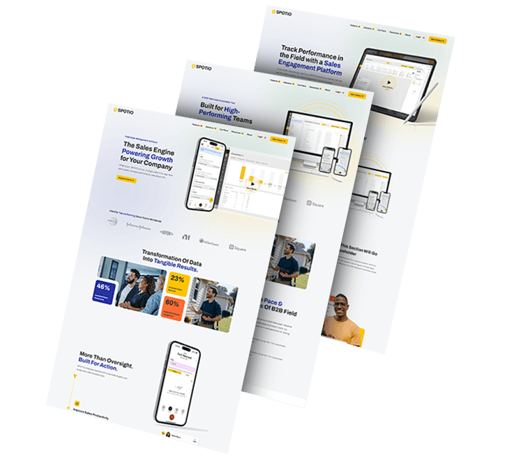
A Refreshed Brand Systemcovering color, gradients, typography, iconography and imagery, consistent from page to page
-
Persona-Based Journeysthat speak directly to field reps, sales managers and sales leaders
-
A Cohesive, Enterprise-Level Experiencewith tighter navigation and deliberate CTA placement
-
SEO Equity Preservedwith high-performing pages migrated so existing rankings carried across
1,000+ Completed Projects
Integrity Electrical: Mapping Who Picks The Sub
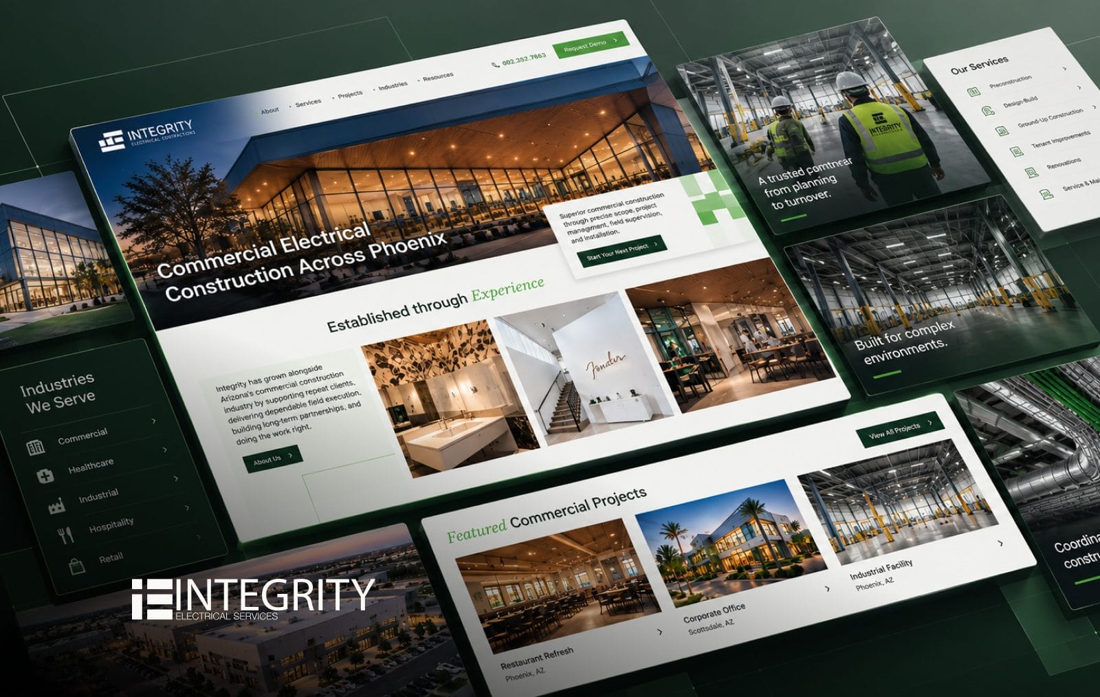
A commercial electrical subcontractor isn’t chosen by one person. Estimators judge fit and risk, project executives assess capacity, and facilities managers look for long-term support. Integrity Electrical’s old site spoke to none of them.
We built the strategy around that buying committee, then rebuilt the site portfolio-first, with project pages showing square footage, delivery method and industry, and separate contact paths for new construction and service requests.
General contractors can now judge whether Integrity has done work like theirs before they ever pick up the phone.
Clearinghouse CDFI: Built For The Brokers Who Close Deals
Discovery for Clearinghouse CDFI turned up a surprise: the loans that actually closed weren’t coming from direct borrowers. They came from brokers, but the site had been designed as if borrowers were its only readers.
We split the site into separate borrower and investor paths, made qualification part of the borrower experience instead of the fine print, and mapped the loan pre-application field by field into Salesforce so every qualified inquiry arrives already attributed.
Through the replatform, Ahrefs estimates show organic traffic up 87% from the pre-launch low to the launch month, with 23 keywords in the top three positions.

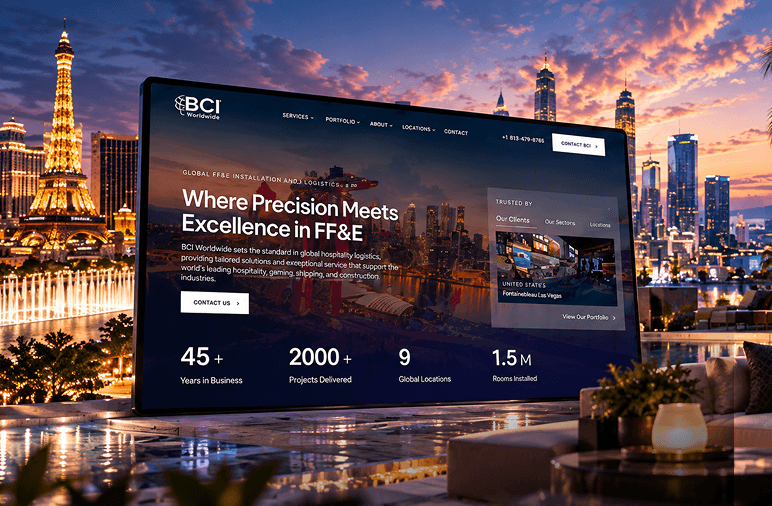
BCI Worldwide: A Global Footprint, Location By Location
BCI Worldwide has spent 45 years installing furniture, fixtures and equipment for hospitality brands like Wynn, Marriott, MGM and Hilton, but its site had no structure for a company with offices around the world.
We built a locations-first architecture with a scalable page for every office, a portfolio that tells the story behind projects like The Londoner Cotai, and a homepage that opens with 2,000+ projects and 1.5M rooms installed.
The structure has grown with the business, from 6 location pages at launch to 9 as BCI expanded into markets including Bangkok and the Philippines.
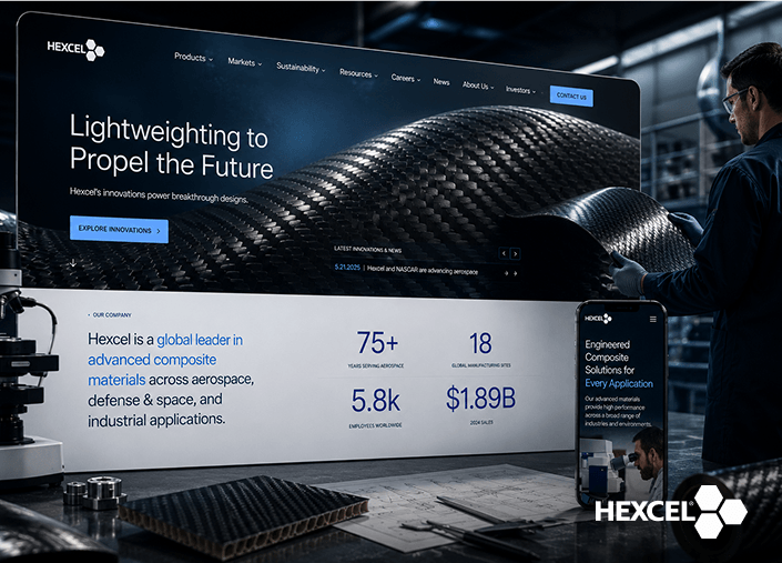
Hexcel: Bringing Technical Buyers Back
Returning users rose 70.1% after Hexcel’s relaunch, an important number for a site whose audience researches advanced composite materials over many visits before specifying them.
Engineers and procurement teams in aerospace, defense and industry had struggled to find the technologies and specifications they needed. We reorganized the product architecture and built clearer content paths toward the technical documentation.
Comparing February 6 to March 13, 2026 with the previous period, active users also rose 132% and engaged sessions 76.52%.
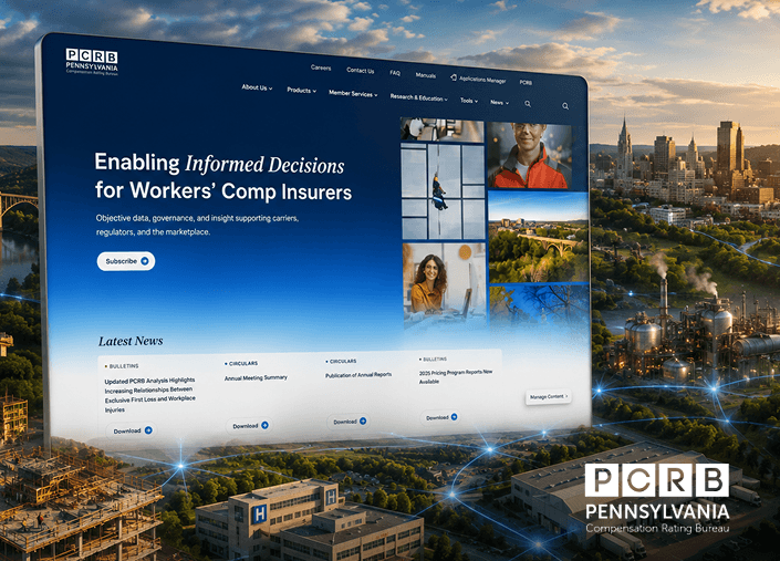
PCRB: Ending The Guesswork Over Current Rules
When members of the Pennsylvania Compensation Rating Bureau opened a manual, they often couldn’t tell whether it was the current version. Working from superseded regulatory content was a constant risk, and finding anything meant searching large PDFs by hand.
We moved more than 6,000 regulatory documents into a searchable Digital Library, consolidated circulars, announcements and meeting notices into one hub, and built pathways around how carriers, employers and agents actually work.
PCRB’s team now publishes and governs its own content on an enterprise WordPress CMS, with no developer dependency.
Digitizing Your Business Growth
Start a conversation with us
"*" indicates required fields